CheckBoxes
Option bars are used quite often in the windows environment as they can only have two outputs 0 and 1 these get used to process the form. In this example it will be used to change the some text from normal to bold or to italic. 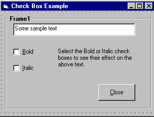
Private Sub chkBold_Click()
If chkBold.Value = 1 Then ' If checked.
txtDisplay.FontBold = True
Else ' If not checked.
txtDisplay.FontBold = False
End If
End Sub
Private Sub chkItalic_Click()
If chkItalic.Value = 1 Then ' If checked.
txtDisplay.FontItalic = True
Else ' If not checked.
txtDisplay.FontItalic = False
End If
End Sub
This example can be found at "smaples/PGuide/controls/Controls.vbp" or downloaded free from the download page.
The checkboxes can be turned on at runtime by simply typing
name.value = 1 ' 1 On , 0 off
Note: If you create the frame first and then add the option buttons by single clicking on the toolbox and dragging the cross hair cursor on the frame to create the controls, they will be attached to the frame and will move with it if you decide to re-position the frame. Notice, however, that if you create the frame first and double click the screen controls, then drag them from the centre of the form on to the frame, they will not be attached to it and will be left behind when you try to move the frame. Try this out.
Notice that when you run your application the same icon is loaded first (probably the clipboard, if you created that option button first). You can alter the option that has the focus first, by selecting one of the other option buttons and setting its property tabindex to 1.
Option Buttons
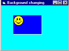
Changing the background colour
Changing the background colour gets used mostly by freeware, or the type of programs you generate for use with banners or adverts, anyway it might come in useful sometime. This example shows an ordinary picture of a smiley face then I put in some nice background colours to make it stand out more.
Private Sub Form_Load()
BackColor = QBColor(Rnd * 15)
ForeColor = QBColor(Rnd * 10)
Picture1.BackColor = QBColor(Rnd * 15)
Picture1.ForeColor = QBColor(Rnd * 10)
End Sub
List boxes
Note :
List boxes and combo boxes are used to supply a list of options to the user. The toolbox icons representing these two controls are for list box and for combo box.
A list box is used when the user is to be presented with a fixed set of selections (i.e. a choice must be made only from the items displayed, there is no possibility of the user typing in an alternative).
Examples might be offering a list of the days in a week, the available modules in an elective catalogue, the holiday destinations available from a particular airport or the types of treatment offered by a beauty salon.
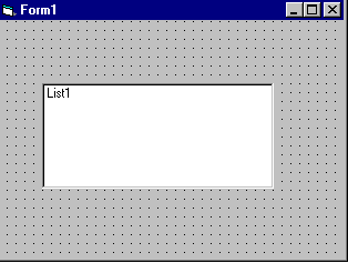
To create a list box, double click on the toolbox icon . Drag the resulting box into place on the form and size it according to the data it will hold. The left hand picture below shows a list box that has been created and sized on Form1. In the middle is the code that is required to load a selection of cars into the list. The data has been included in the procedure Sub Form_Load so that it appears when Form1 is loaded. Finally, the picture on the right shows what appears on the form when the application is run. Notice that vertical scroll bars are added automatically if the list box is not deep enough to display all the choices.
If you however add the following source code to this project
Add to a Lisbox
Private Sub Form_Load()
List1.AddItem "Monday"
List1.AddItem "Tuesday"
List1.AddItem "Wedsday"
List1.AddItem "Thursday"
List1.AddItem "Friday"
List1.AddItem "Saturday"
List1.AddItem "Sunday"
End Sub
The source code should look somthing like this :

Removing & Advanced Options
Note: They appear in the order they were typed if you changed the properties window by changing sort order = true then they will go into alpaetical order. List items can be added and deleted all the list is counted as the order they are in so for exapmple if you wanted to delete "Tuesday" you would type
list1.RemoveItem 1
And to add to the list in a paticular order just add
list1.additem "My Day", 5
This will be added after saturday.
And finally to clear the lisbox type
List1.clear This will completly clear the contence of the listbox.
Note: The property ListCount stores the number of items in a list, so list1.ListCount can be used to determine the number of items in list box list1.
The property ListIndex gives the index of the currently selected list item. So the statement list1.RemoveItem List1.ListIndex removes the currently highlighted list item.
Adding an item can be accomplished very neatly using an input dialog box. Try this:
list1.AddItem InputBox("Enter a day", "Add a Day") This will open a message box and prompt you for a new day to enter this will then be added to the list index at the bottem unless you specify were it should go.
Combo Boxes
Combo boxes are of three types (0,1 and 2), setting their properties/styles determines the type. Combo boxes (style 0 and 2 ) are a good choice if space is limited, becaue the full list is displayed as a drop down list, it does not occupy screen space until the down arrow is clicked.
Picture of combo box style 0

The user can either enter text in the edit field or select from the list of items by clicking on the (detached) down arrow to the right. The drop-down Combo box, list is viewed by clicking on the down arrow. This type of combo box does not have a down arrow because the list is displayed at all times. If there are more items than can be shown in the size of box you have drawn, vertical scroll bars are automatically added. As with previous type, users can enter text in the edit field.
Drop-down List box (Style=2)
It is slightly confusing to find this control under combo box. This control behaves like a regular list box except that the choices are not revealed until the down arrow is clicked. The user can select only from the choices given, there is no text entry facility.
Note: Combo boxes of style 0 and 2 cannot respond to double click events. |
